Tuesday 18 December 2012

Creature Project - Artist Research

Here are some artists I found that relate to the Creature Project.


Marta Altes
I love how she has used pencil sharpenings and simple lines to create characters. It's very clever, I would never have thought of that.


 Shaun Tan
I love the shading that Shaun has used for this little creature. It's cute that he has given it suitcases made out of nutshells, this also gives us a recognisable scale to think about it so we know the creature is really small.


Mattias Adolfsson
These look like they were ink splodges like what we did and he has made characters from them. They are all very odd and I wonder if he would have ever thought them up if it weren't for the ink... Or is it ink? Maybe he made the characters and then shaded them in ink. Either way, they are very interesting and unusual.

Tuesday 27 November 2012

Amazing Artist

I was searching google images for illustrator art and came across this page. It's pretty cool, you should check it out.
Here's one of her many drawings.

Monday 26 November 2012

Colour and Shape

This time we have a week long project. As you can tell by the title, it's called 'Colour and Shape'. The basic idea of it is that you have to pick one of four themes; Natural forms, Man made forms, Architecture and Human forms. I chose human forms as they are hard but also interesting. Most people are 'programmed' to recognise faces in many different places. So, if you do it well enough, you could draw a face using very simple lines, which is a skill that, as an illustrator, would be a valuable skill to have.

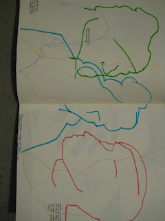
At the beginning of these pages from my sketchbook, I wasn't doing incredibly well. We had to draw the outline of a figure or part of a person, without any interior detail... like a silhouette.


In these drawings, we were allowed to add three more lines to hint at features. I am pleased with the blue one but the green and pink are very inaccurate.

sorry about the pictures again!!

 We then drew pictures in the same way on the back of a large sheet of paper that we had inked on and use two colours of oil pastel to cover the rest.
 Then we used scissors and cut out the outline on poster paper without initially drawing it out first. (I enjoyed this part the most!)


Then we had a colour theory session where we chose sections from a magazine and tried to recreate in with paint. As you can see from this lop-sided picture, I got pretty close with the blue and red but the green wouldn't get anywhere near. I think this is because we didn't have cyan blue.
We also did the same thing using the computer, which was faster, easier and more accurate!
 

Sunday 25 November 2012

A is for A4

In this short project, we had to choose a word beginning with 'A' and create a spider diagram of what that word meant to us and what we thought of when we heard that word.
After doing our group spider diagram, I chose the word 'Africa' as it was the word that I was most inspired by. I did much research in the college library and looked through travel guides for South Africa... I soon realised that it was going to be really hard to do observational drawings of the landscape and wildlife of Africa without going there and we only had the weekend to complete this project.
Here are the photographs of me creating the final piece after doing as much as I could with the research I had collected from the library.

I have included some of my research pages and how I have layed them out.
I appologise in advance that you will have to tilt your head to view the first few photographs because something has glitched in Blogger and it likes to alter my images without my say so and not let me change them back...


 I was pleased with how this lion cut-out turned out, though I would have liked to have made a more intricate design. I did try a more intricate one but it just kept ripping. Maybe one day within this course I will try this again and buy a new blade for my scalpel as it hasn't had a blade change since I got it... two years ago...
That could have been the reason.

Tuesday 20 November 2012

Drawing with Wire

Exactly what it says in the title! We cut ourselves a length of wire and bent it with our hands so it looked like a 2D, continuous line drawing of the people we had sat at our tables. If there was a part that we wanted to stick together for either structural support or to attach more wire when we ran out, we used an electric spot-welder with two copper parts that connected when you pushed the handle down.


Portraits 2

Here are some that we did where we couldn't take the charcoal or graphite stick off the page and we couldn't look at the page, but stay looking at the person we were drawing so we could teach ourselves to really look at what we were drawing.
We then moved 1 place clockwise and drew the next person in front of us the same way. This made us overlap our drawings, making an interesting strip of drawings we created as a whole group.


Monday 19 November 2012

Portraits 1

Here we created portraits of the new class mates we met using objects supplied to us by our tutor. Both of the girls on my table had dramatic side fringes, which I tried to show in some of my portraits.

Sunday 11 November 2012

Illustration 3

5) I have always been relatively aware of illustration in our everyday lives, but I didn't think about just how far the specialisms could go... For example, cookery illustrations and greetings cards. I have been inspired by the work of Luke Pearson as you can see on my previous post. I simply love most of his work, especially the work for the 'Hilda' comics. On NoBrow they have now brought out plastic toy Hildas which is a sign of great success.
I find the specialism of children's books and story boarding characters for animations to be the most interesting because I love how films and picture books can stay with you for a lifetime, even if you forget what the book is about or what the words say, you remember how they were illustrated. That is what I love so much... I want to be the person who helps you remember a story for your whole life, the person who helps you visualise before you really know what the words mean that your folks are reading to you. That's what they were to me and that's what I want to give to someone else.

Thursday 8 November 2012

Illustration 2

4

E.H Shepard

http://25.media.tumblr.com/tumblr_m5cbc9eHiW1r3n31vo1_500.jpg

I was brought up on the work of E.H Shepard and the original 'Winnie-the-Pooh' stories and so the artwork resonates with me. If you have read the article from Computer Arts that I posted a link to on myt previous post, you will understand what I mean when I say that a picture is what makes a children's book. I love the simplicity of these sketches, but how easily you can grasp emotion and meaning. For example, Piglet is obviously worried and confused. We can tell this simply because he has lifted a hand to his mouth and there is a simple, slanted line above his eye which suggests his eyebrows are furrowed in worry.

Barbara Firth

https://blogger.googleusercontent.com/img/b/R29vZ2xl/AVvXsEg7VsQrbvUnFt7ARW6fUz4odWyxQAQHPq-IsEFaf3rh3QlVlN0cWznHiFQibe1kCa-TjUBRY7IRM1RCicMYrFatL5KHoQH7VSZR9iq3nb7JRXL6o-jlZjcrz3170hTkVuJaXRd2SDJjBBA/s1600/Cantsleeplittlebear_Firth3.jpg

I was brought up with these books too. I remember them and my mum recently found the book at a charity shop and it brought back so many memories just from the illustrations. I think images that remind you of a time in you life as well as the story they were telling is fantastic and these will always be special to me.

Stina Wirsen

http://feed.ne.cision.com/wpyfs/00/00/00/00/00/13/AE/DF/10659-1.jpg

I found this artist while looking through a friend's blog and just had to see some more of her work as the image that my friend had chosen to illustrate her style was so interesting. I love her sparse use of colour to hint and highlight shapes. It has a very doodled look to it and I think that's what I like most about it, I like that there is no floor that they all stand upon, but a mish-mash of images thrown in together.

Steph Baxter

 http://www.pingg.com/blog/wp-content/uploads/2010/12/Screen-shot-2010-12-20-at-12.37.13-PM.png

http://www.ammomagazine.co.uk/pics/artist%20page%20graphics/issue3/Steph%20Says%20Hello%20-%20Ammo%20Mag%20Images/StephBaxterPorfolio2.jpg

 I love how cartoony and light hearted these Illustrations are. They are very cute and that's so in at the moment. The typography is fabulous and well and all the little doodles surrounding it. The second image is so simple and I can see it being a card design, which proves how diverse being an illustrator can be. I didn't think about card designs.

Luke Pearson

 http://www.theaoi.com/blog/wp-content/uploads/2012/04/LukePearson2_blog1.jpg

 Another cute one. I found this artist while looking through the back issues for NoBrow magazine. I have looked through some of the pages of this comic online and the illustrations are so good. These are the kind of things that I want to progress onto and it was this illustrator and this comic that has inspired me to try and create my own.

John Tenniel


http://wordyenglish.com/alice/i/jt/p20/alice_06d-cheshire.png

http://www.alice-in-wonderland.net/alicepic/alice-in-wonderland/1book1.jpg

 I love the illustrations for the original sketches of 'Alice in Wonderland' 1865. All of the images were wood engravings rather than drawings. There were a total of 42 images in the book done in this technique. I love the amount of detail in the and how they have been shaded using very neat cross-hatching. To know that these images were carved out of wood, inked up and then pressed against the page is just fascinating.