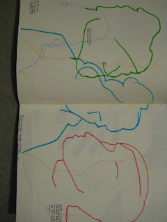
This time we have a week long project. As you can tell by the title, it's called 'Colour and Shape'. The basic idea of it is that you have to pick one of four themes; Natural forms, Man made forms, Architecture and Human forms. I chose human forms as they are hard but also interesting. Most people are 'programmed' to recognise faces in many different places. So, if you do it well enough, you could draw a face using very simple lines, which is a skill that, as an illustrator, would be a valuable skill to have.
At the beginning of these pages from my sketchbook, I wasn't doing incredibly well. We had to draw the outline of a figure or part of a person, without any interior detail... like a silhouette.
 |
| In these drawings, we were allowed to add three more lines to hint at features. I am pleased with the blue one but the green and pink are very inaccurate. |
sorry about the pictures again!!
We then drew pictures in the same way on the back of a large sheet of paper that we had inked on and use two colours of oil pastel to cover the rest.
Then we used scissors and cut out the outline on poster paper without initially drawing it out first. (I enjoyed this part the most!)
Then we had a colour theory session where we chose sections from a magazine and tried to recreate in with paint. As you can see from this lop-sided picture, I got pretty close with the blue and red but the green wouldn't get anywhere near. I think this is because we didn't have cyan blue.
We also did the same thing using the computer, which was faster, easier and more accurate!


No comments:
Post a Comment