Tuesday, 6 November 2012

Illustration

1) The specialisms of Illustration can be children's book, book covers, cookery book, technical drawings, fashion illustration, storyboards, comics, posters and so on.

2) I struggled to find a website that I could get the link to a full article without subscribing or becoming a member. I did, however, find this article in an issue of Computer Arts that explains perfectly the way I feel about children's book illustrations. Though it is from a 'computer' arts magazine, it makes many references to the great classics of Quentin Blake who made Roald Dahl's books what they are. We recognise the books because we recognise the illustrations.
Click here to view the full article.

3) Ronald Searle

http://i.telegraph.co.uk/multimedia/archive/01586/mikes_1586879c.jpg

http://www.benpentreath.com/wp-content/uploads/2012/01/Mrs-Mole-by-Ronald-Searle-001.jpg

I really like these pieces, his work reminds me of Quentin Blake's work for the Roald Dahl books. I like how the simplicity of shadow and shape make the images to easy to decipher. Though the top image is all black and white and is a mash up of black lines, you can figure out what is going on and feel some form of emotion about it. I feel like it would be a very loud and crowded place and because I can feel myself there, It's obviously I good picture.

Sunday, 28 October 2012

Graphic Design 6

When I came onto this course, I had already completed a two year Graphic Design course. Just before completing this course, I decided that graphic design wasn't for me. While I enjoyed some of the projects and some of the typography, I much preferred my drawing projects with Sam Winnard. 
Throughout my two year course, I became increasingly aware of design around me and how it influenced me day to day, this week I was reminded how it truly is everywhere, from the magazines you read to the design on the box of cereal you have in the morning.
I think the discipline of Graphic Design that I find most interesting is typography. I like how you can influence how someone 'hears' the text when they read it by having some parts in a larger print or a blocky font and how serif and sans serif can make the difference between someone with dyslexia (like me) being able to read something easily or struggling. This is why on all of my blog posts I haven't settled for the default font and have always changed it to Helvetica. (Also, Helvetica has been chosen as the best font so far by Graphic Designers around the world.)
I have enjoyed this week in Graphic Design, but it hasn't changed my mind and, though I will always think about the design that is all around me, it won't be the chosen career for me.

Friday, 26 October 2012

Graphic Design 5

Raygun

 I like the Raygun Magazine because it's not the traditional form of cover. There is a lot of text, up-side-down, over-lapping, faint, bold and some doesn't even seem to be English. A lot of popular magazines will have an image covering some of the text because they know people will still know what it is. This one, on the other hand has cut off the top of the image before it even reaches the text. I also like how the 'N' in 'Gun' is joined to the 'U'.

Olly Moss

I really like the work of Olly Moss and how he uses a very controlled colour palette of usually black, white and another colour. I love this poster in particular. His work is very clever and has many images or meanings throughout the design. For example, this one is an image of a hand bursting from the earth which is a typical piece of imagery when thinking of zombies. When you look into the hand, you see trees and a house, in the bottom left, you can see a man digging a grave. This describes in a very compressed way the story of 'The Evil Dead'. 
It's so clever and the media in which it was created is interesting too, I like how it looks traditional.

Sister Corita

 I like the work of Sister Corita because it has nice messages. She is a woman of God and so tries to spread love through her work. They are all colourful and beautiful. I like how you have to work a little to read it as the writing is up-side-sown or reversed, but when you have taken the time to read and understand the message you feel happy and at peace.

Ed Ruscha

http://www.hirshhorn.si.edu/wp-content/uploads/2012/03/Ed-Ruscha-In-the-Collection.jpg

I like how this work looks to be made out of paper layed on it's side to make it look 3D. A lot of his work is made from rather odd materials, for example egg whites, fruit juice, grass strains and blood. His work either has a meaning to it or just seems to be in the purpose of an experiment, which I like because even if it doesn't have a recognisable meaning behind it, it would have been a learning curve for him and he will have made progress because of it. Sometimes the transition from one work to another is visable.

Maricor Maricar


On one of my projects in Graphic Design last year I really got into the work of Maricor Maricar. They were shown to me by my tutor as it was similar to the work that I was thinking of creating and it helped me to improve my ideas. The detail and precision that goes into each of their works are simply amazing, which is one of the reasons why I chose to do my project in a similar style, so I could fully appreciate how difficult it is to make work this way. I enjoyed it thoroughly and have a high level of respect for them.

Why Not Associates

http://25.media.tumblr.com/tumblr_m6v6agkRhI1qh0usho1_1280.jpg
 I really like the style of this comedy carpet. It has famous quotes from comedians and funny films all put down as a massive poster and the floor in an old fashioned style that looks so fabulous. The whole thing is very simple with simple colour schemes, but put in huge on the floor in Blackpool and it becomes a massive success. I love it.

Wednesday, 24 October 2012

Graphic Design 4

4)
Stefan Sagmeister

  
I really like this piece. It says, "Being not truthful works against me." It's clever that it is written in a web because it could relate to a web of lies or 'not truthful'-ness. It can be a little difficult to read which is one of the best things in Graphics as it makes the public stop and concentrate to decipher what it says. Using just black and white keeps it simple so the message can be portrayed clearly and not hidden in a mass of colour.

Wim Crouwell

http://accreativestudio.com/wp-content/uploads/2010/02/ac-abc.jpg

I really like this image. It shows the creation of one of his typefaces. I like how he has left the working marks on the page so you can work out how he came about making it. It looks to be done on paper and I can only imagine if it was done by hand, but I think it is. He has managed to recreate the font perfectly by using his marks. I think it's an interesting typeface.

Alan Fletcher

[Alan+Fletcher+ici+co+magazne1965.jpg]

I like how Fletcher has organised these signs. As you will see from my previous post, one discipline in Graphics is signs and symbols. That would mean creating or recreating them, Fletcher has used existing ones with another discipline of layout to create this image. It looks very odd but I like it. It's a limited colour palette of red, blue and green but it stands out and is very striking.

Kris Sowersby

The Love of Type 
Kris Sowersby is a Typeface Designer. Some of his typefaces are really simple but very nice and sophisticated. This is an image that he created and I simply Google Imaged his name and it was near the top of the first page. As soon as I saw it I clicked it because I knew that this was the one I wanted. I'm not sure what it is about it, but I just like it. I like that the flourishes off the sides of the letters are continued lines from the inter hatching design. I like that it looks so doodled as if a smitten school girl/boy had scribbled in absentmindedly in the back of their notebook while their minds driften over a school crush or something. It just screams innocence and fun. I love it

Pep Carrio


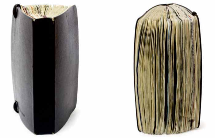
Pep Carrio has done some amazing visual journals and is an inspiration. It's like a picture book to the inside of his mind. I love how thick the book is, almost as though he couldn't stop. The drawing and collages are fabulous and it makes me want to start creating journals too!

Noma Bar

http://www.donnahall.co.uk/wp-content/uploads/2012/01/nomabar8.jpg 

 I really like what this very simple image means. They have used a pound sign '£' on a plain shape that is taken to represent a face. The cross through the sign represents this man's eyes, while the flick and the bottom is his moustache. There is a cigar coming out of the counter of the sign. What I like most is the combination between the very simple shapes and colours and the much deeper meaning. Rich people smoke cigars and have handlebar moustaches, and it's a '£' that represents his face. It's fantastic design.

Tuesday, 23 October 2012

Graphic Design 3

1) Six main disiplines within Graphic Design include advertising, web design, corporate identity, packaging, typography and sign and symbols.

2) We all went down to the Chesterfield College Library to look at what Graphic Design magazines/journals were available. The main ones that we relevant were Eye Magazine, Creative Review and Computer Arts. I found a rather interesting article in Eye magazine about a comic magazine called 'Katy Keene' (1645-61) which captured the essence of post-war America. Katy Keene was all about glamour and is described in the article as, "less exotic 'pin-up', more girl next door-" and was later crowned as 'pin-up Queen'.
The resaon I really like this article is because it called for fans to submit their own artwork that would be published in the magazine along with the fan's postal address so people could contact them. Because of this approached they achieved and mantained a loyal fan base, many who went on to become established designers in their own right, for example; Anna Sui, Betsey Johnson, Lloyd Sensat, Jack Evans, Barbara Rausch and John Lucas.
I really like how it managed to create artists from the public through a comic magazine that anyone could walk to the shop an buy. In the magazine they also did dress-up paper dolls that you could cut out and change the outfits. This is what caught my eye at first with the article as I used to have a modern version of this type of doll and I loved it. Definitely fun for every one and a little trip down memory lane for me, although of course it wasn't this exact model... I wasn't around then!
Click here to view the article.

3) I have looked at the Design Museum in London's website and have found this famous graphic design company, 'Graphic Thought Facility'. I used to research them in my Graphic Design course last year and really like their design for 'habitat', simple but clever. 
Click here to view their page.

Graphic Design 2

Here are the words that we had to pick from a list of six. I chose 'Consume', 'Collapse', 'Flowing' and 'Stability'. At first I struggled with this as it was a very abstract way of thinking but then it came a lot more naturally. 

In the end I quite enjoyed this. 


I didn't like or really understand doing to background. I understand that it helped us think about shapes and colours that may relate to the words we had chosen, but I feel that it took the centre of attention away from our designs.

Monday, 22 October 2012

Graphic Design


Here is a photograph of the work we did today. We had to pick 4 objects, draw from the type on the packaging in thumbnail form, pick a thumbnail design and copy it on the the collage and ink ground we made. Here is what I created.

Top left - graphite stick, single line.
Top right - pastel, left handed.
Bottom left - black water-colour.
Bottom right - blocked shape out with masking tape then went over with a dark blue, water-colour wash.