4)
Stefan Sagmeister

I really like this piece. It says, "Being not truthful works against me." It's clever that it is written in a web because it could relate to a web of lies or 'not truthful'-ness. It can be a little difficult to read which is one of the best things in Graphics as it makes the public stop and concentrate to decipher what it says. Using just black and white keeps it simple so the message can be portrayed clearly and not hidden in a mass of colour.
Wim Crouwell

I really like this image. It shows the creation of one of his typefaces. I like how he has left the working marks on the page so you can work out how he came about making it. It looks to be done on paper and I can only imagine if it was done by hand, but I think it is. He has managed to recreate the font perfectly by using his marks. I think it's an interesting typeface.
Alan Fletcher
![[Alan+Fletcher+ici+co+magazne1965.jpg]](https://blogger.googleusercontent.com/img/b/R29vZ2xl/AVvXsEiUt0SbpjYMGPDfe9eJZs6lTRqpF_3RXDtRWFow-6zAju-IywIqPxslyPr-MS0-MTQ3BSYP0Ha-DSxKqqW2-wQTQ7dVFIObgw8D85g5e8lcqZBjxTFy5T6L3K2qS1UpbCsc5Y5x3H6xv_ZO/s1600/Alan+Fletcher+ici+co+magazne1965.jpg)
I like how Fletcher has organised these signs. As you will see from my previous post, one discipline in Graphics is signs and symbols. That would mean creating or recreating them, Fletcher has used existing ones with another discipline of layout to create this image. It looks very odd but I like it. It's a limited colour palette of red, blue and green but it stands out and is very striking.
Kris Sowersby

Kris Sowersby is a Typeface Designer. Some of his typefaces are really simple but very nice and sophisticated. This is an image that he created and I simply Google Imaged his name and it was near the top of the first page. As soon as I saw it I clicked it because I knew that this was the one I wanted. I'm not sure what it is about it, but I just like it. I like that the flourishes off the sides of the letters are continued lines from the inter hatching design. I like that it looks so doodled as if a smitten school girl/boy had scribbled in absentmindedly in the back of their notebook while their minds driften over a school crush or something. It just screams innocence and fun. I love it
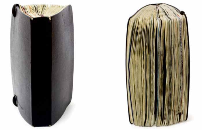
Pep Carrio


Pep Carrio has done some amazing visual journals and is an inspiration. It's like a picture book to the inside of his mind. I love how thick the book is, almost as though he couldn't stop. The drawing and collages are fabulous and it makes me want to start creating journals too!
Noma Bar

I really like what this very simple image means. They have used a pound sign '£' on a plain shape that is taken to represent a face. The cross through the sign represents this man's eyes, while the flick and the bottom is his moustache. There is a cigar coming out of the counter of the sign. What I like most is the combination between the very simple shapes and colours and the much deeper meaning. Rich people smoke cigars and have handlebar moustaches, and it's a '£' that represents his face. It's fantastic design.
Kris Sowersby
Kris Sowersby is a Typeface Designer. Some of his typefaces are really simple but very nice and sophisticated. This is an image that he created and I simply Google Imaged his name and it was near the top of the first page. As soon as I saw it I clicked it because I knew that this was the one I wanted. I'm not sure what it is about it, but I just like it. I like that the flourishes off the sides of the letters are continued lines from the inter hatching design. I like that it looks so doodled as if a smitten school girl/boy had scribbled in absentmindedly in the back of their notebook while their minds driften over a school crush or something. It just screams innocence and fun. I love it
Pep Carrio
Pep Carrio has done some amazing visual journals and is an inspiration. It's like a picture book to the inside of his mind. I love how thick the book is, almost as though he couldn't stop. The drawing and collages are fabulous and it makes me want to start creating journals too!
Noma Bar
I really like what this very simple image means. They have used a pound sign '£' on a plain shape that is taken to represent a face. The cross through the sign represents this man's eyes, while the flick and the bottom is his moustache. There is a cigar coming out of the counter of the sign. What I like most is the combination between the very simple shapes and colours and the much deeper meaning. Rich people smoke cigars and have handlebar moustaches, and it's a '£' that represents his face. It's fantastic design.
No comments:
Post a Comment